Class Exercise 2
Sunday, April 19, 2009
last written on: 8:33 PM ♥
(0) comments.
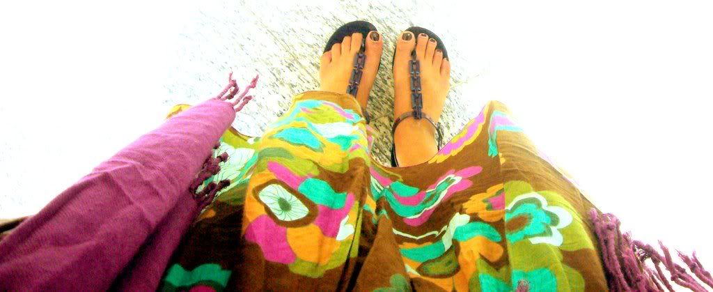
Your Notion of Colourful Asia
Thursday, March 19, 2009
last written on: 7:52 PM ♥
(0) comments.
I had a lot of difficulty in gathering inspiration for this assignment. The notion of colourful Asia was very hard to grasp because there are so many nuances of Asia that I felt I would not be able to capture.
Moreover, it was hard not to fall into the trap of doing a touristy postcard.
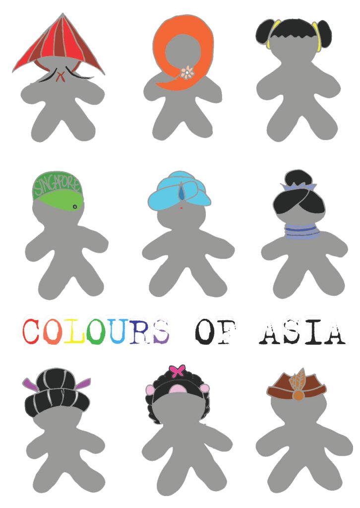
I decided that the most wonderful thing about Asia is that all hairstyles and headgears are uniquely different and distinct to each culture. Thus, I decided to use a blank body as a canvas, rather than drawing in faces and expressions which are not my main point of the postcard. And highlight the hairstyle, with the distinctively black Asian hair and different colours for each culture.
I chose relatively bright solid colours for the hairstyles and gears to make them stand out. And give them a little more depth by adding a colour 2 notches darker.
I decided to change the background of the postcard to see which colour actually highlights my 9 asians best.
I felt that the white best highlighted the differences in colour and allowed the colours to pop out, rather than blend in with the background.
As such, this is my final postcard:
Assignment 3: Save, Prevent, Kill.
last written on: 7:52 PM ♥
(0) comments.
I've always been an advocate of saving the environment, so when the topic was first released, I knew I wanted to do something to do with Global Warming.
I did some research on the posters that were already present.
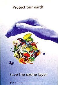
I realised that something that was common in all those posters are:
1. Use of the image of a globe, either in flames or replaced with rubbish.
2. Use of industrial smoke and factories to represent greenhouse effect.
3. Use of a hand to represent our responsibility as a citizen.
I knew I didn't want to do all those things, especially when as a student, it would be impossible for me to take a photo of the Earth, etc.
I wanted to have these elements:
1. It is our responsibility.
2. What happens to the Earth happens to us.
3. The warming effect.
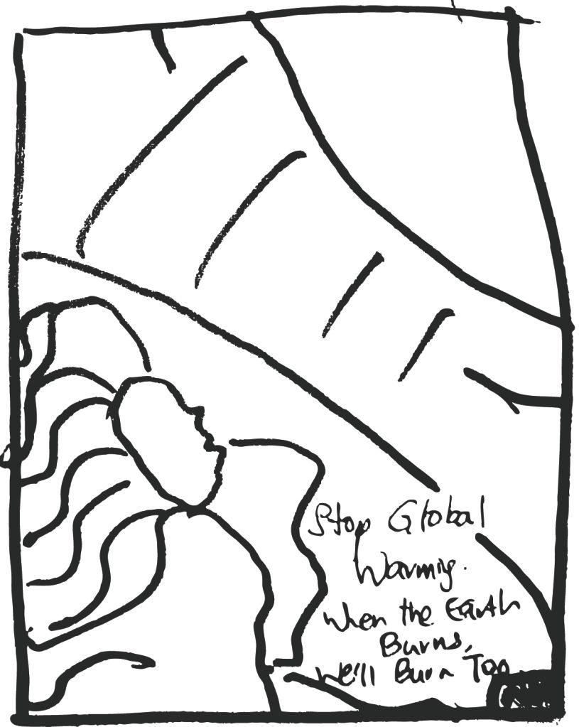
Idea 1
A vectorized melting earth.
Idea 2
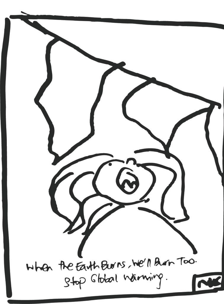
The sun shining really brightly on the girl and the girl's hair bursting out in flames to signify the effect of global warming being a direct issue to us.
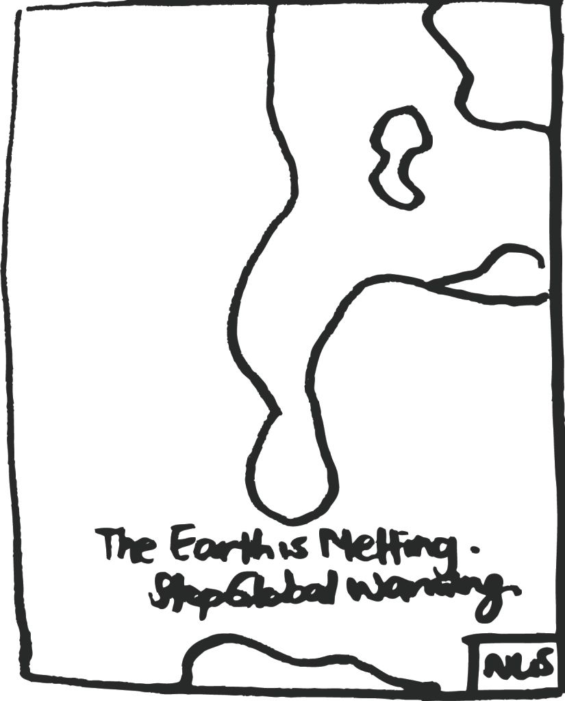
Idea 3
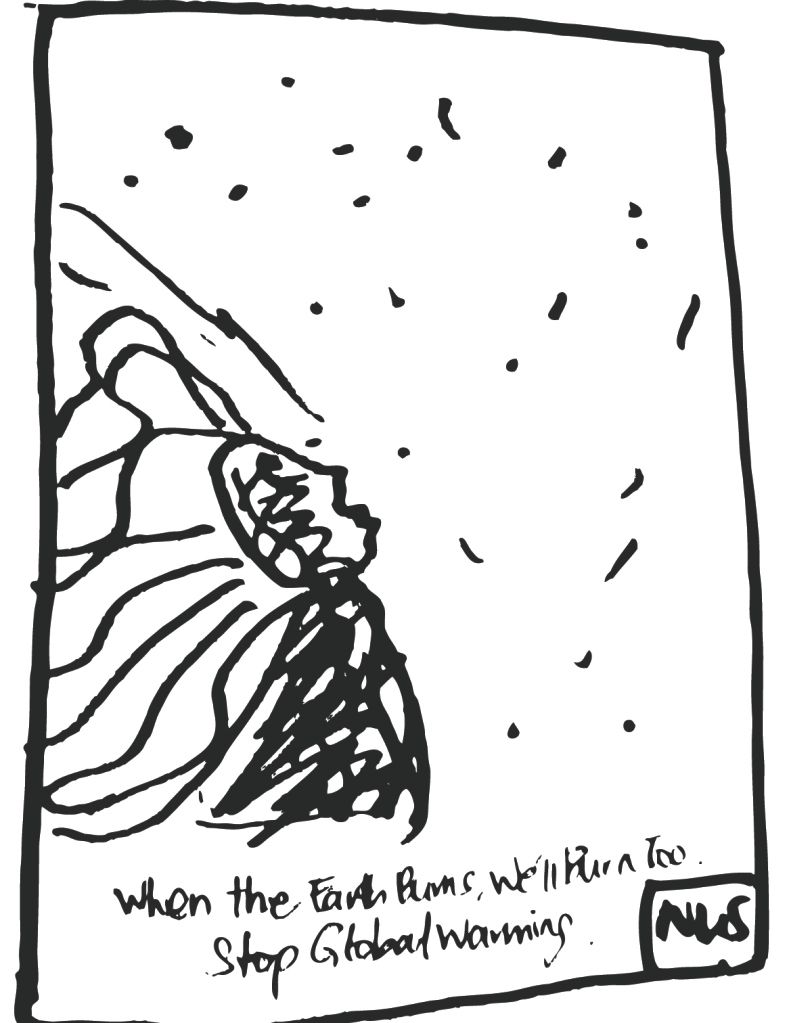
I decided to take a more individual approach to the matter. To make it more identifiable with the audience, I thought of the idea of a flaming girl. Flaming up because of the burning earth. And specks of fire in the air, just a girl burning.
Idea 4
A girl directly under the sun and burning under it.
In the end, I chose idea 3 because I think it is the most effective in creating interest in looking at the words. It might not directly link to the idea of global warming but it captures the attention of passerbys because people usually are able to identity with faces.
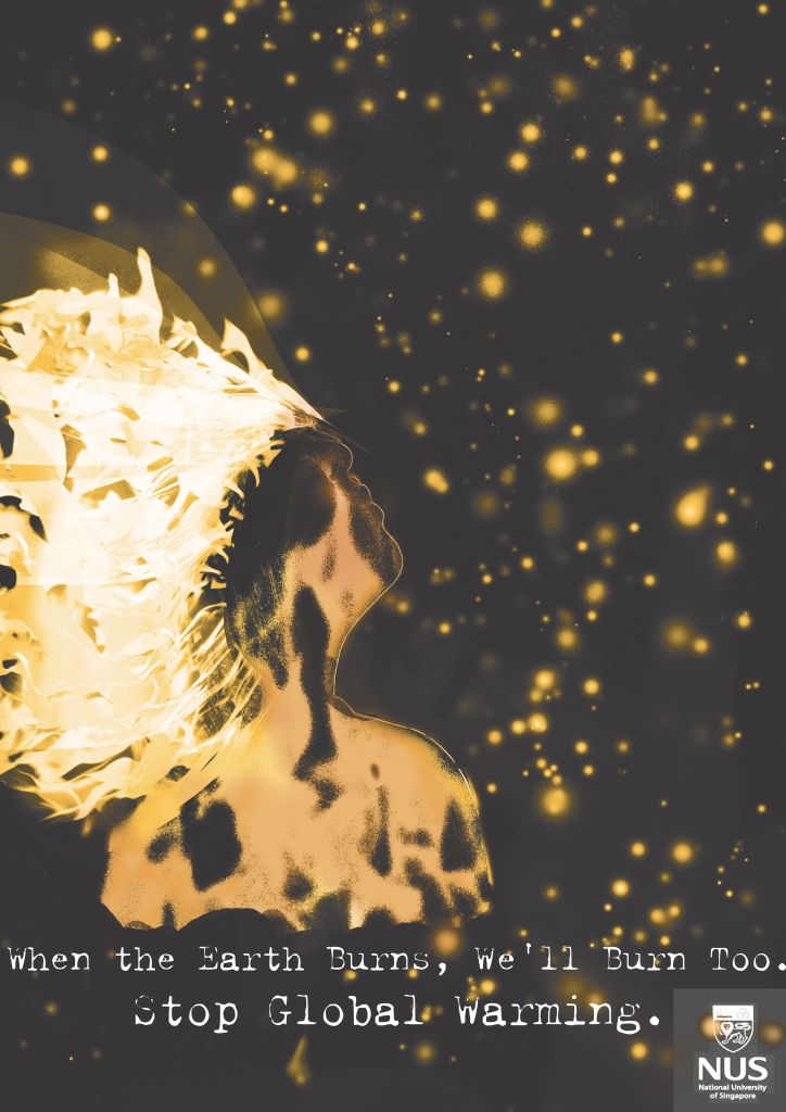
This is effective in the more individualistic culture that we have now. And the tagline is "If the earth burns, we'll burn too. Stop Global Warming". Short concise and tells the idea.
Assignment 3: U C What I C
Thursday, March 5, 2009
last written on: 10:21 AM ♥
(0) comments.
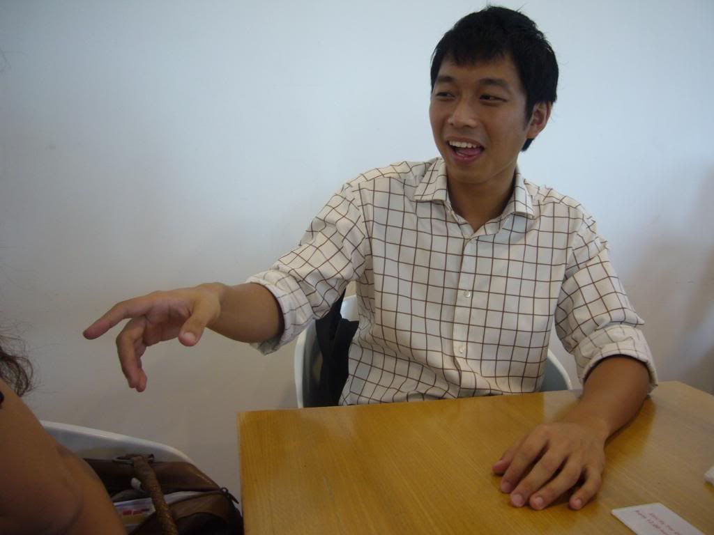
Can you tell the story?
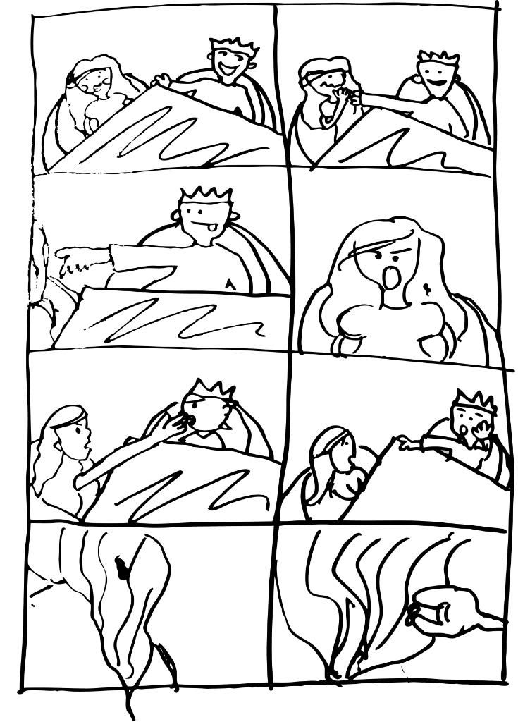
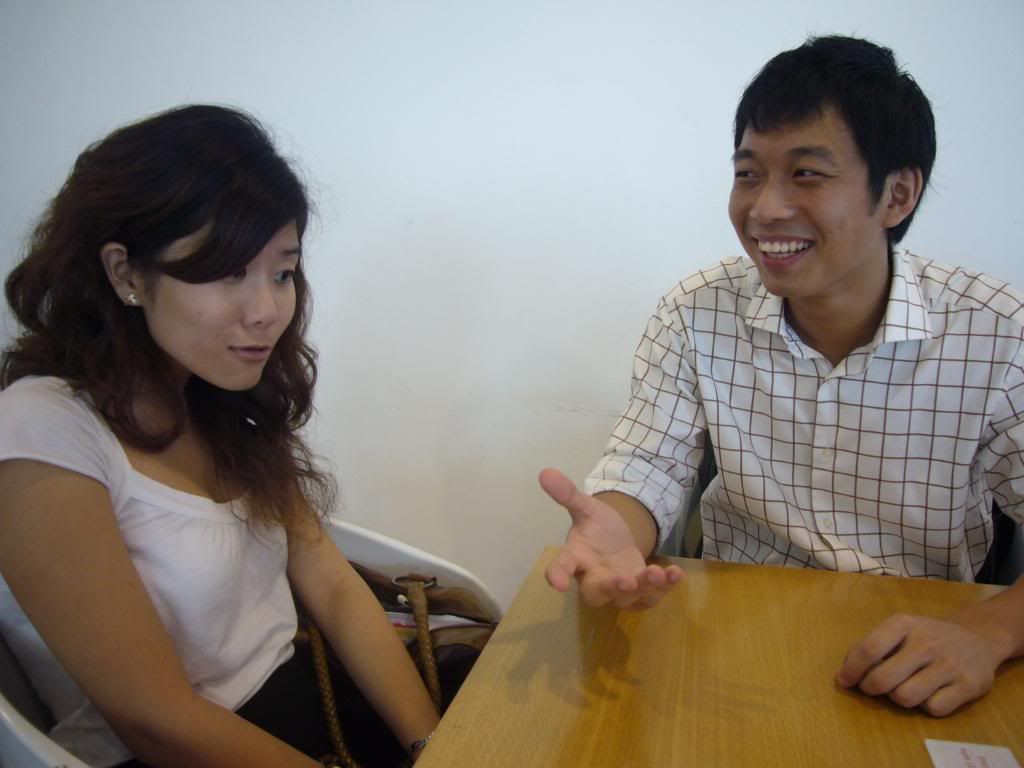
I had my two friends, Mike and Esther in mind when I was doing the storyboard.
Scene 1: Mike and Esther are on the first date. Esther is a bit shy but Mike is reasonably comfortable in his own skin. This is to show the contrast in character and to tell the audience a bit about the situation.
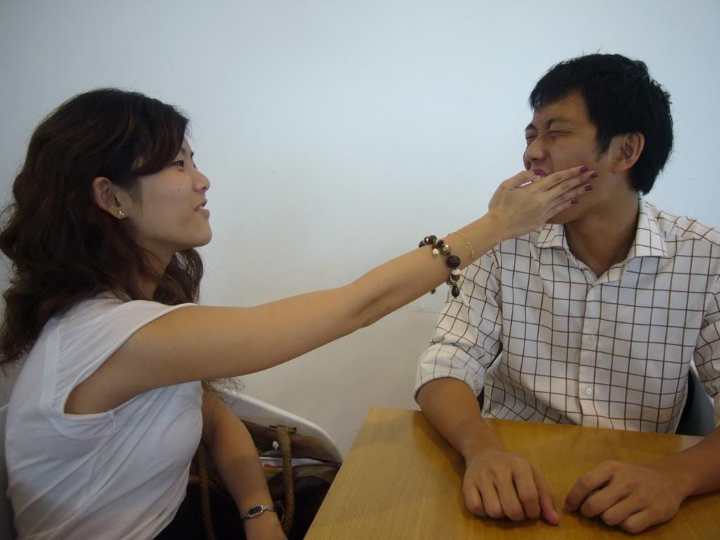
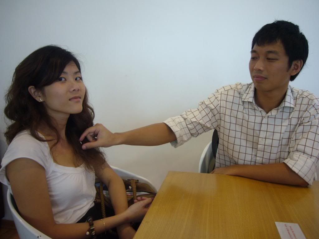
Scene 2: Mike reaches out towards Esther's chest and Esther is awkward about it.
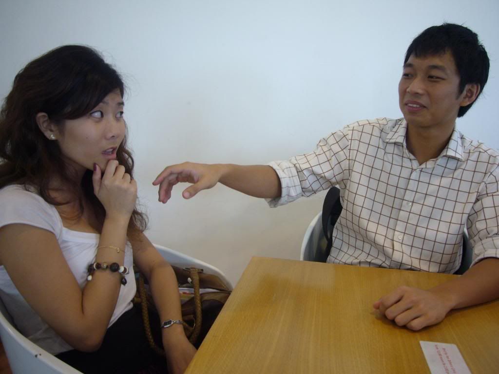
Scene 3: Deep in concentration, a close up of Mike is done to give the audience a feel.
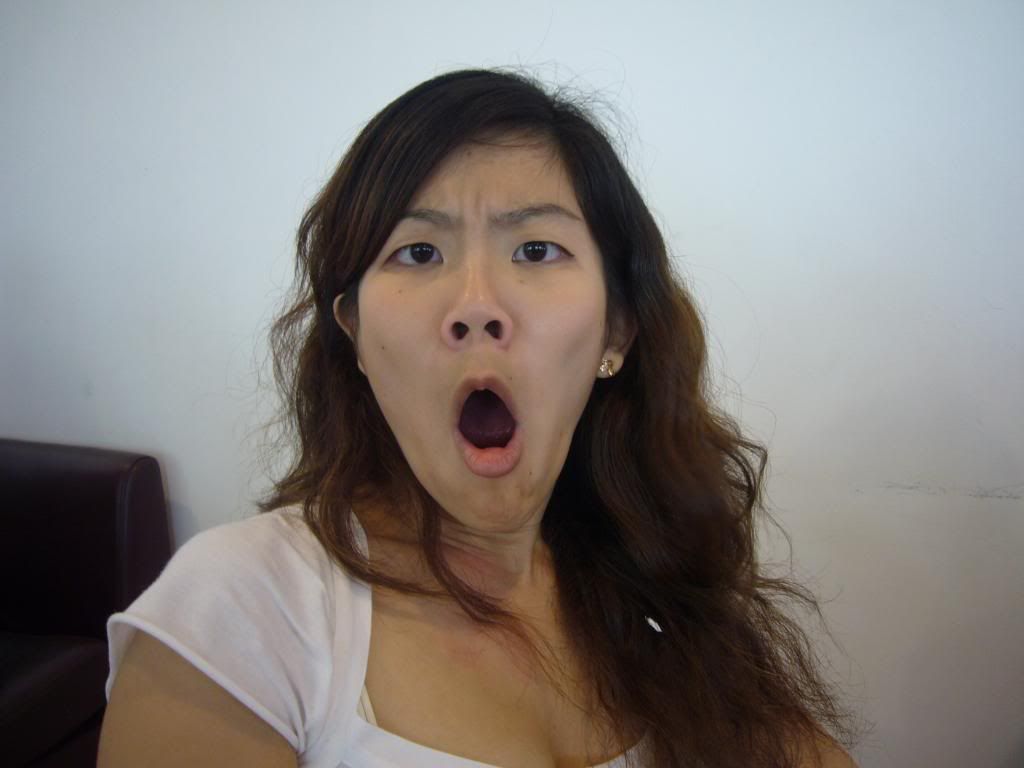
Scene 4: Close up on Esther to show the shock.
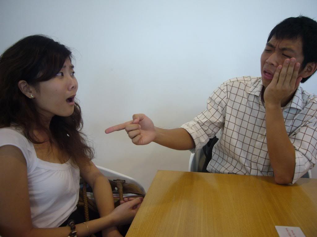
Scene 5: Esther slaps Mike. (Self-explanatory.)
Scene 6: Mike points to something and tries to explain that there's something in her hair.
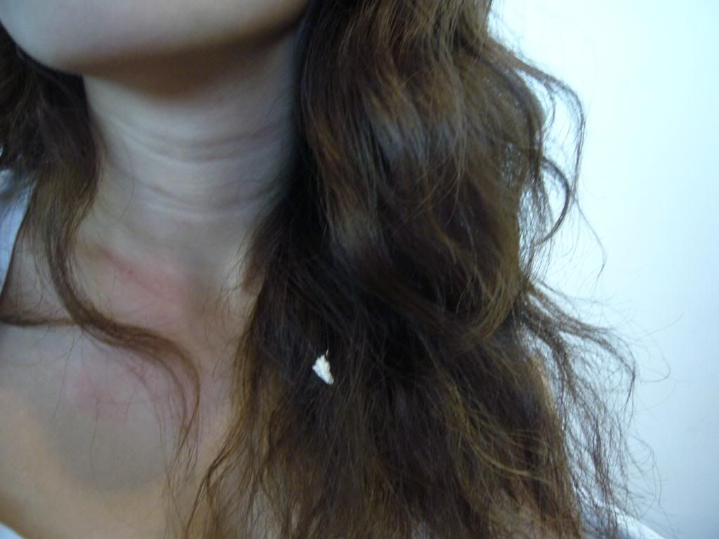
Scene 7: Close up of the tissue debris in Esther's hair. I decided that her neck has to be seen to contextualise the photo event.
Scene 8: Mike's fingers picking up the tissue. To show a happy ending.
Assignment 2: Abstraction
last written on: 10:20 AM ♥
(0) comments.
No vulgaritiesI was at a family dinner one evening and my little cousin, Gabriel, who is only in primary 2, started scolding expletives for the fun of it. It dawned on me that such courtesies should be taught by the school. They are probably trying to uphold such rules but little children being little children do not listen and tend to forget.
So I thought it is necessary to create something that can act as a visual reminder to these children. It will act as a top-of-head reminder.
I took a picture of my friend Zhimin scolding vulgarities.
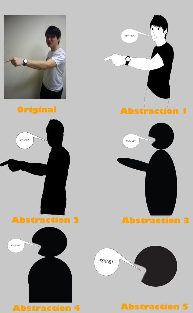
As it is very hard to capture words that is said and it would be obscene to use it in the pictogram. I decided to use the speech bubbles with the typography ~!@#$% which is commonly understood to be vulgarities.
The first abstraction is all the details including facial expression.
Expression and even the details of clothes and accessories like watches are not needed and thus in the second abstraction, I simply filled it black.
The details of the body shape is also unnecessary as it does not change the meaning of the communicated message. And therefore in the third abstraction, simple shapes was used to communicate this.
I felt that hand gestures complement vulgarities but it does not define vulgarities. In other words, it's not a defining gesture and so it was omitted in abstraction 4. Also I seek to simplify the shape.
In the last abstraction, I omitted all details, leaving only the head of the person and the speech bubble.
My final pictogram is the 4 one.
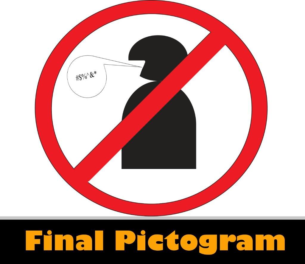
I chose it over the last one because I felt it was necessary to show the body, so that the head will not appear to be too disjointed.
Me, Myself and I
Thursday, February 12, 2009
last written on: 9:19 AM ♥
(0) comments.
Drama QueenI'm big on expressions and I've been in theater ever since I was 9 years old. In fact, when I asked my friends to describe in a word, the responses I received were "energetic", "expressive", "dramatic", "passionate".
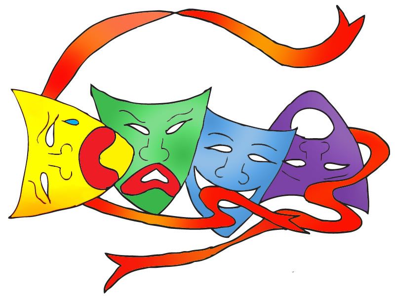
Thus I decided that I would use the theme of drama to express who I am. I thought that theater masks are iconic to drama and theater.
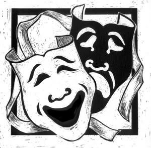
It is something that people can easily identify as drama and theater. I drew inspiration from these theater masks.
However, I didn't just want the notion of me to be one dimensional. As a person, we are all made up of dynamic nuances and I think its important to showcase all of these elements of me this assignment.
For the purpose of this assignment, I decided to go by my short form name, CASS.
These are some of my thumbnails.
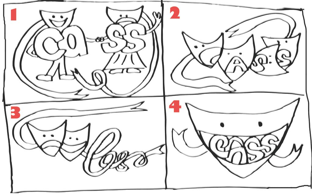
I don't like idea 1 because my name looks like 2 different entities, Ca and ss. However, I was trying to show a split in the emotions like sadness versus happiness. I didn't like the bodies because it is a bit literal rather than representative.
I like idea 2 because my name is seamlessly put into the shapes of the mouths of the masks. In addition, it does show the theatrical side, the freedom of expression (the free flowing ribbons) and the variety of emotions (the 4 different identifiable faces).
I like the free flowing ribbons and feel of idea 3 but it doesn't seem to show the vibrancy. It looks a bit too relax and not dramatic which should be the main point of the essence of me.
Idea 4 is using my name as the outline of the teeth in a smile. Doesn't seem very creative and still doesn't show much of my nuances.
Therefore, I chose idea 2 and developed it further.
I tried to put the elements I liked from idea 3 and 4 in as well. The freedom of the ribbons signifying the freedom of emotions as well as the smile, which makes the picture more holistic and less forced and deliberate and balanced.
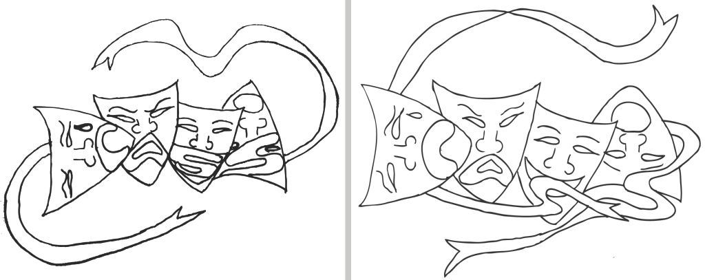
I decided to go with the second rough because I feel that there's more flow and balance to it. The ribbons serve a purpose and are not for decorative purposes like in the first one and it incorporates the nuances in design appropriately.
Thus, this is my final.
I chose this final prototype for the following reasons:
1. It is vibrant, in terms of color and it expresses my dramatic nature.
2. It is relevant. There are 4 emotions that are the most common emotions and are easily identifiable.
3. The freedom of flow is also expressed through the free flowing ribbons. This is to represent free expression.
This final prototype represents the essence of me.
Lecture Exercise 1: Creative Machine
last written on: 9:00 AM ♥
(0) comments.
Creative helmet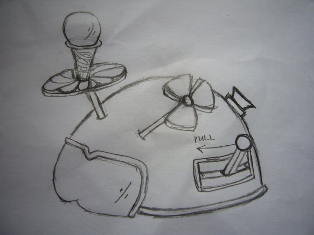
I believe that creativity comes from everyday inspirations and thus, my creative machine is inspired by motorcyclists' helmet.
To activate this helmet, pull the joss stick. This will make the mechanisms like the Spinning Idea Churner (SIC), that's located on the left to spin. Creative energy from your surroundings, like music, friends and family, poems, books etc, will be converted by this SIC into visual form that can be viewed by the user via the visor. The user will be able to visualise the creative idea dervived from everyday inspirations.
These ideas can be as huge as building sandcastles in the sky because we don't want to stop the mighty SIC from churning daily inspirations. So to cool down and tame this mighty SIC, the fan on the right can be activated by clicking the button on the back. This brings the user back down to earth, to choose a creative idea that can actually be created physically.